Beyond the Storm Living™️ is an Amazon Associate. I earn from qualifying purchases at no extra cost to you and may also earn from other affiliate links.

Tuesday, July 29, 2025

How to Blend Watercolors like a Pro: 5 Easy Techniques for Smooth Gradients (Beginner-Friendly Guide)

July 29, 2025 0 Comments

Ready to create smooth, professional watercolor gradients? These 5 proven blending techniques will transform your paintings from amateur to amazing. Whether you're a complete beginner or looking to refine your watercolor skills, this step-by-step guide will give you the confidence to create those dreamy blends you've been admiring.

How to Blend Watercolors like a Pro: 5 Easy Techniques for Smooth Gradients (Beginner-Friendly Guide)

Master professional watercolor blending techniques and create stunning smooth gradients in your paintings

Blending watercolors used to feel like a losing battle — harsh lines, weird streaks, and muddy patches were a regular part of my early paintings. If you've been there too, don't worry — you're not alone!

The truth is, blending is one of the most important watercolor techniques to master. Once you learn how to control it, you'll be able to create smooth transitions, beautiful gradients, and dreamy color fades with ease.

In this comprehensive watercolor guide, I'll show you exactly what watercolor blending is (and what it isn't), plus five essential techniques that will level up your painting skills fast.

🎨 Essential Watercolor Blending Supplies for Smooth Gradients

Before mastering watercolor blending techniques, having the right supplies makes all the difference. Here's what experienced watercolor artists recommend:

  • 100% Cotton Watercolor Paper – Cold-pressed, 140lb minimum for best blending results
  • Quality Round Brushes – Sizes 6, 10, and 14 for different blending areas (check out my complete Princeton brush guide for the best synthetic options)
  • Professional Watercolor Paints – Artist-grade pigments blend smoother than student-grade
  • Water Containers – Use 2-3 containers: one for rinsing dirty brushes, one for medium-clean water, and one for clean water blending
  • Natural Sponge – Perfect for creating soft, organic blending effects
  • Paper Towels – Essential for controlling water and lifting excess paint

🎨 What Is Watercolor Blending?

Watercolor blending is the fundamental technique of creating smooth transitions between colors or values in your paintings. Think soft edges, gentle gradients, and seamless shifts from dark to light that give your artwork that professional, polished look.

It's easy to confuse blending with similar terms, so let's clear that up:

  • Blending is not mixing — Mixing happens on your palette. Blending happens on the paper.
  • Blending is not shading — Shading creates depth. Blending softens edges and joins colors.
💡 Quick Tip: Blending can also be a compositional tool. Soft edges attract less attention, while hard edges pull the eye. This helps guide your viewer through your painting!

🖌️ 5 Essential Watercolor Blending Techniques for Professional Results

1. Wet-on-Dry Watercolor Blending (Pulling Out Technique)

This professional watercolor technique means applying wet paint onto dry paper — perfect for when you want soft edges with maximum control over your blending.

Try this:

  1. Paint a shape on dry paper.
  2. Rinse your brush , blot it (so it's damp, not dripping), and gently touch the edge of the painted shape.
  3. Pull the pigment outward in soft strokes to blur the edge.
  4. Repeat if needed, but don't overwork it.
🚫 Watch out: Too much water can cause unwanted blooms (those fuzzy cauliflower shapes).
💡 Pro Tip: If your paper dries too fast, switch to 100% cotton watercolor paper—it stays wet longer, making blending smoother.
Professional wet-on-dry watercolor blending technique tutorial step by step beginner guide

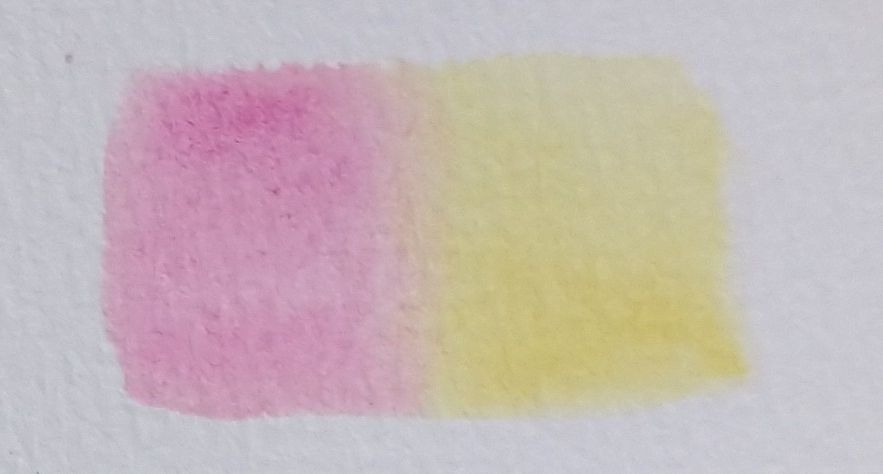
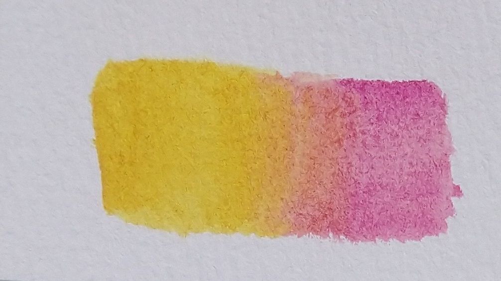
2. Wet-on-Wet Watercolor Blending (Let the Paint Flow Naturally)

This magical watercolor technique allows colors to merge and flow effortlessly, creating those stunning organic blends that make watercolor paintings so captivating.

Here's how:

  1. Wet the area of your paper with clean water.
  2. Load your brush with pigment and drop it in.
  3. Add another color while it's still wet and watch them blend naturally.
💡 Ideal for: Skies, backgrounds, and dreamy, organic effects.
🎯 Key Trick: Tilt your paper slightly to help colors flow together.
Smooth watercolor gradients using wet-on-wet blending method for beginners

3. Graded Wash Technique (Perfect Smooth Gradients Every Time)

Use this professional watercolor method to fade one color from intense to soft — absolutely perfect for painting realistic skies, backgrounds, and achieving those smooth gradient effects.

Steps:

  1. Start with a rich mix of color at the top.
  2. Paint in horizontal strokes.
  3. As you move down, dilute your paint slightly with water each time.
  4. Let gravity help — tilt your board if needed.
🚫 Avoid streaks: Work quickly and keep your brush wet.
Perfect graded wash watercolor technique for beginners sky painting tutorial

4. Two-Color Watercolor Blending (Seamless Color Transitions)

Master this technique to create beautiful color transitions that flow seamlessly into each other, essential for realistic watercolor painting.

Wet-on-Wet Method:

  1. Paint one color and quickly add the second before it dries.
  2. Let them merge naturally — resist the urge to over-blend!

Wet-on-Dry Method:

  1. Paint two shapes side by side.
  2. Use a clean, damp brush to soften where they meet.
🌈 Great for: Petals, skin tones, and colorful washes.
Seamless two-color watercolor blending transition Wet on Wet Seamless two-color watercolor blending transition Wet on Dry

5. Lifting Technique for Watercolor Blending (Soften Edges & Fix Mistakes)

This professional watercolor method is a blend-saver and a gentle way to fix harsh edges, lighten areas, or create soft highlights in your paintings.

How to Do It:

  1. While the paint is still damp, press a dry brush or tissue into the area.
  2. Gently lift pigment — don't scrub!
  3. For edges, dampen with a clean brush and pull the color inward.
✨ Perfect for: Fixing muddy spots or brightening highlights.
Watercolor lifting technique for fixing mistakes and creating soft edges tutorial

🛠️ Common Watercolor Blending Mistakes & Professional Fixes

Even professional watercolor artists run into blending challenges — here's how to handle them like a pro:

Mistake Quick Fix
Hard edges where you wanted soft? Re-wet the edge and gently blur with a damp brush.
Backruns or blooms? Blot gently if wet. If dry, soften with clean water and lift pigment.
Colors turned muddy? Let layers dry completely before adding more. Avoid over-blending complements (like red + green).
Paper drying too fast? Use cotton watercolor paper—it holds moisture longer.
💡 Don't stress perfection! Some of the best textures come from happy accidents.

✨ Master Watercolor Edge Control for Professional Blending Results

Professional watercolor blending is all about controlling edges. Here's how to master this essential skill:

  • Soft edges = More water, gentle brushwork
  • Hard edges = Less water, let layers dry fully
  • Lost & found edges = Alternate between soft and crisp strokes
🎨 Try this exercise: Paint a simple shape and practice softening just one side.

🙋‍♀️ Watercolor Blending FAQ – Expert Tips & Answers

Q: Are watercolor blending techniques easy to learn?
Watercolor blending can be challenging at first, but with consistent practice and the right techniques, you'll master water control and create professional-looking gradients.
Q: How do I prevent unwanted watercolor blending?
Use the wet-on-dry technique and avoid rewetting painted areas. Always let layers dry completely between applications for crisp, controlled edges.
Q: What's the best watercolor paper for smooth blending?
100% cotton watercolor paper (like Arches or Fabriano) stays wet longer and allows for smoother, more professional blending results.

🧪 Master Watercolor Blending: Practice Makes Perfect

Watercolor blending techniques might seem challenging at first, but with these 5 professional methods, you'll be creating dreamy gradients and smooth color transitions in no time. The key to mastering watercolor blending? Consistent practice and experimentation!

Now grab your quality watercolor brushes, pick a few colors, and start practicing these blending techniques. Remember — every "mistake" is just a chance to discover a new watercolor effect. Happy painting! 🌟

Wednesday, July 23, 2025

Princeton Artist Brushes: Complete Watercolor Brush Line Comparison Guide - Aqua Elite vs Neptune vs Velvetouch vs Snap vs Heritage

July 23, 2025 0 Comments
Princeton's Top 5 Synthetic Watercolor Brush Lines: Affordable Pro Performance - Which One Should You Choose? (2025)

I highly recommend Princeton’s synthetic watercolor brushes for beginners, intermediates, and pros alike. With a wide variety of lines, Princeton truly has something for every artist’s taste and painting style.

Princeton's Top 5 Synthetic Watercolor Brush Lines: Affordable Pro Performance - Which One Should You Choose? (2025)

Princeton Artist Brush Company has established itself as a leader in synthetic watercolor brush technology, offering artists high-quality alternatives to natural hair brushes at accessible price points. Their innovative use of taklon synthetic fibers, developed in collaboration with master Japanese brush-maker Naohide Takamoto, has created synthetic brushes that rival the performance of traditional sable while offering superior durability and easier maintenance.

Whether you're a beginner exploring watercolor painting or a seasoned professional seeking reliable watercolor brushes, Princeton offers several distinct brush lines, each designed to meet specific artistic needs and budgets. Understanding the differences between these synthetic watercolor brushes can help you make informed decisions about which brushes will best serve your artistic goals.

Neptune Series 4750

Neptune brushes are designed to mimic natural squirrel hair, featuring Princeton's softest synthetic fibers with exceptional water-holding capacity. Princeton gives the Neptune a stiffness rating of 1, making it the softest brush in their lineup with minimal snap and spring. The soft synthetic hair is thirsty and holds oceans of color for painting, with the synthetic hair holding just as much color as natural squirrel bristles. This makes Neptune ideal for wet-on-wet techniques and large washes where maximum water capacity is prioritized over precision control.

Aqua Elite Series 4850

The Aqua Elite series represents Princeton's premium watercolor offering, designed for artists who demand exceptional water-holding capacity and smooth color release. These brushes are very soft and hold an incredible amount of water and pigment, making them excellent for covering large areas, though they sacrifice some spring and snap for their superior flow characteristics. The series features comfortable black ergonomic handles with a grippy coating material that provides excellent control and comfort for artists, especially beneficial for those with hand sensitivity.

Velvetouch Series 3950

The Velvetouch line is Princeton's premium multi-media brush, comprised of a multiple-filament luxury synthetic blend designed for excellent color-holding capacity, precision tapering, and resilient spring. These brushes feature precision tapering that creates the thinnest, longest point of all Princeton brushes, making them exceptional for detailed work. While capable of handling oil, acrylic, watercolor, and gouache, these brushes are particularly praised by watercolor artists for their excellent water and pigment holding capabilities with nice, even release. The soft-finish wood handles provide comfort during extended painting sessions, complementing the enhanced performance of the Velvetouch filaments.

Heritage Series 4050

Heritage Series 4050 was Princeton's first synthetic sable brush offered to artists more than 25 years ago. This series features a blend of golden taklon in multiple diameters to mimic natural sable hair, providing natural snap with enhanced color holding capacity and excellent point retention. As Princeton's original synthetic sable line, Heritage represents the foundation upon which the company built its reputation for quality synthetic brushes. The Heritage line offers excellent value and performance, making it particularly well-suited for beginners learning watercolor techniques.

Snap Series

The Snap series focuses on precision and control at a budget-friendly price point, designed for artists who need crisp, defined brushstrokes without breaking the bank. These affordable watercolor brushes prioritize the "snap" characteristic that allows for sharp, controlled marks and excellent shape retention, making them ideal for detailed work and precise techniques.

Detailed Comparison Table

Feature Neptune 4750 Aqua Elite 4850 Velvetouch 3950 Heritage 4050 Snap
Softness to Snap Scale 1 (Softest) 2 3 4 5 (Most Snap)
Primary Use Watercolor (squirrel-like) Watercolor Multi-media (excels in watercolor) Watercolor Precision work
Water Capacity Exceptional (squirrel-like) Exceptional Very good Good Good
Spring/Snap Minimal (softest) Low Good Excellent Excellent
Handle Style Standard Black ergonomic coating Soft luxury wood Traditional Standard
Fiber Type Soft synthetic, synthetic version of squirrel Soft synthetic, Better Than Natural Kolinsky Multi-media synthetic, Animal friendly Golden taklon blend, original synthetic sable Precision synthetic
Price Point Mid-range Mid-range Mid-range Mid-range Budget
Best For Wet-on-wet, large color areas Large washes, wet techniques Multi-media, watercolor detail Traditional watercolor techniques Detail work, controlled strokes
Durability High High Very high Excellent High
Shape Retention Good Good Good Excellent Excellent
Color Release Smooth and even Smooth and even Versatile Natural Precise
Recommended Skill Level Intermediate to Advanced Intermediate to Advanced Intermediate to Advanced Beginner to Professional All levels
Unique Features Softest brush Maximum water capacity Thinnest, longest point Original synthetic sable Budget-friendly precision
Product Image Neptune Brushes Aqua Elite Brushes Velvetouch Brushes Heritage Brushes Snap Brushes
Check Prices Check Neptune Check Aqua Elite Check Velvetouch Check Heritage Check Snap

Choosing the Right Princeton Watercolor Brush Line

Your choice among these Princeton watercolor brush lines should depend on your painting style, preferred techniques, and budget considerations. The Neptune excels for those who want the softest brush for wet-on-wet techniques, while Aqua Elite offers maximum water capacity for flowing watercolor work. Velvetouch serves artists who work across multiple mediums and need the finest point for detailed work (like botanical), Heritage provides excellent value for beginners learning traditional watercolor techniques, and Snap offers budget-friendly precision for detailed work.

Each line represents Princeton's commitment to innovation in synthetic brush technology, ensuring that regardless of your choice, you'll receive a watercolor brush that offers superior performance compared to many natural hair alternatives while being more affordable and easier to maintain.

🎨 Ready to Start Your Watercolor Journey?

Don't let poor brushes hold back your artistic potential! Whether you're just starting out or looking to upgrade your current set, Princeton's synthetic brushes offer professional quality at beginner-friendly prices.

💬 Which Princeton brush line caught your attention? Leave a comment below and let me know which features matter most to you - maximum water capacity, finest point, or budget-friendly precision!

📌 Save this guide for future reference and share it with fellow artists who are looking for quality synthetic brushes. Your art community will thank you!

Monday, July 21, 2025

Cactus Blossom

July 21, 2025 0 Comments

🌿Cactus Blossom with a Limited Primary Palette🌿

In this watercolor painting session, I followed the Cactus Blossom tutorial by @debbiefriispettitt and painted using a limited palette of just three primary colors. This simple setup helped me focus on color mixing, value, and harmony—all key skills for watercolor beginners. Materials: M. Graham Nickle Azo Yellow PY150, M. Graham Ultramarine Blue PB29, Quinacridone Magenta PR122 QOR, Kilimanjaro Original Bright White Watercolor Block - 140 lb.

Working with fewer colors is a fun and mindful way to improve your technique. Whether you're a beginner or looking to simplify your process, a limited palette is a great way to grow as a watercolor artist.

Have you ever tried using a limited palette in your watercolor paintings? Let me know in the comments!

Thursday, July 17, 2025

Magnolia Branch

July 17, 2025 0 Comments

🌿 Moody Magnolia Branch in Watercolor 🌿

Sometimes flowers aren't meant to be bright. This magnolia branch emerged in muted purples - a twilight version of spring's classic bloom.

Techniques from Magnolia Branch by Rae Campbell shows how to build those rich, layered glazes while keeping the petals delicate.

Why I Love Botanical Watercolor

There's something deeply satisfying about painting flowers and plants. Nature, especially beautiful flowers, brings me joy in ways that are hard to put into words. When I sit down to paint a magnolia or any botanical subject, it feels like a quiet conversation with the natural world.

Botanical art has such a rich tradition, and in watercolor, it really comes alive in two main approaches:

  • Detailed realistic botanical art: This style focuses on scientific accuracy and precision. Every vein, every subtle color variation is carefully observed and recorded. It's like creating a beautiful field guide.
  • Loose botanical painting: This approach captures the essence and feeling of the plant rather than every detail. Often no sketching is required - you let the watercolor flow and find the flower's spirit through color and movement.

Both styles can use wet-on-wet techniques for soft, flowing effects, or wet-on-dry for more controlled, crisp edges. The magic happens when you learn to blend watercolors seamlessly - those smooth color transitions can make or break a botanical painting.

The Right Tools for the Job

One thing I've learned is that brush choice really depends on the size and style of your painting. A tiny detailed study needs different brushes than a loose, flowing botanical piece. The right brushes can make all the difference in how your flowers come to life on paper.

Do you prefer moody florals or bright botanicals?

Whether you're drawn to the scientific precision of traditional botanical art or the expressive freedom of loose floral painting, there's something magical about capturing nature's beauty in watercolor.

Want to see more of my watercolor experiments? Check out my art gallery where I share the successes and happy accidents that make this journey so interesting.

Wednesday, July 9, 2025

Watercolor Line and Wash Technique

July 09, 2025 0 Comments

The Joy of Line & Wash:
Where Ink Meets Watercolor Magic

There's something magical about pairing the crispness of ink with the dreamy flow of watercolors. Whether you're sketching at a café or painting in your cozy studio, line and wash lets you balance control and freedom in the most delightful way.

✒️ Lines First, Color Later

Perfect when you want:
• Clear outlines
• Detailed scenes
• Controlled results

Try this with urban sketches or botanical drawings!

🎨 Color First, Lines After

Ideal for:
• Loose landscapes
• Moody atmospheres
• Happy accidents

Great when you want to let the paint lead the dance.

✨ Breaking the "Rules" Beautifully

Some of my favorite line and wash pieces don't follow any rules at all. Here's how to play:

  • Let ink lines wander off like they're daydreaming
  • Use colors that make your heart sing (even if they're "wrong")
  • Embrace blobs and blooms as happy surprises

"Abstract line and wash feels like jazz - structured enough to feel safe, but free enough to surprise you."

Let's Try It Together (Check out my try)

1.

Grab your favorite pen (waterproof!) and sketch something simple - maybe a teacup or a leaf.

2.

Add watercolor - stay inside the lines or let it bleed. No wrong answers!

Which way speaks to you? I'd love to see what you create!

Share Your Art Below →

P.S. My go-to supplies when I want to play:

  • Sakura Micron pens (they never smudge!) My absolute favorite waterproof pens for line and wash! These archival-quality fineliners never smudge, come in perfect sizes for detailing, and last forever #ad Check It Out →
  • Any 100% cotton paper
  • A tiny travel brush for café sketching

Watercolor Practice: Line and Wash

July 09, 2025 0 Comments

Line and Wash Watercolor Dragonfly

This charming dragonfly illustration was created using the line and wash watercolor technique, which blends expressive watercolor washes with the precision of ink drawing. The wings are accented with a subtle shimmer using metallic watercolor paint, giving the artwork a delicate, magical touch.

Inspired by a tutorial from MarenaArt, this painting was more than just a creative exercise — it became a moment of calm. As many watercolor artists know, the process of painting can be deeply therapeutic.

Whether you're exploring loose watercolor techniques, practicing line and wash sketches, or simply looking for an outlet to reconnect with your creativity, this method offers both structure and flow.

🎨 Recommended Watercolor Supplies for Line and Wash Technique

If you're exploring the line and wash watercolor technique, having the right tools makes all the difference. Below are my trusted favorites — perfect for achieving crisp ink lines, smooth washes, and luminous color.

🖼️ Baohong Hot Press Paper

Professional-grade cotton paper that handles ink without bleeding and allows smooth watercolor blending.

Shop Now

🎨 Rosa Gallery Paints

Artist-grade paints with vibrant pigments and great transparency for soft, expressive washes.

Shop Now

🖌️ Princeton Brushes

Versatile synthetic brushes with excellent spring for both detail work and broad strokes.

Shop Now

✒️ Sakura Micron Pens

Waterproof, fade-resistant fineliners that won't smudge with watercolor.

Shop Now

Pro tip: Investing in quality materials makes the painting process smoother and more enjoyable — especially when practicing mindful art or watercolor therapy. These are the tools I return to again and again. If you're on a budget and just starting out, use what you have, but make sure your liner pen is waterproof!

🌿 Your Creative Journey Matters

"Every brushstroke is a step toward mindfulness, and every painting a conversation with your soul."

Did this watercolor technique bring you peace? What artistic challenges would you like to transform into therapy next?

Your inspiration might be exactly what another artist needs to hear today.

Tuesday, July 1, 2025

Why My Salt Technique Failed (Even After Practice)...and How to Fix the Most Annoying Salt Problems

July 01, 2025 0 Comments

The Art of Salt in Watercolor: When Chemistry Meets Creativity

How to master this magical (and sometimes maddening) technique

Watercolor painting is a journey where happy accidents often lead to the most stunning effects. One of my favorite ways to create organic textures is by harnessing the power of ordinary salt. From delicate table salt to chunky sea salt, this humble kitchen staple can transform your washes into mesmerizing landscapes of texture.

🧂 The Science Behind the Magic

When salt meets wet watercolor, a fascinating dance begins. The salt crystals absorb water, pulling pigment toward them and creating beautiful starburst patterns. The results vary dramatically based on:

  • Salt type (fine table salt vs. coarse sea salt)
  • Paper wetness (that perfect "moist brownie" stage)
  • Pigment properties (some colors just refuse to play nice)
  • Paper quality (100% cotton handles salt best - more on this below)

🎨 "It's like chemistry class but with prettier results and less chance of explosions."

🌧️ Problem #1: "My Salt Just Melted Into a Sad Puddle"

Why It Happens:

  • Your paper was too wet (think soup rather than moist brownie)
  • Humidity is working against you (salt's worst frenemy)
  • Using non-cotton paper that can't handle moisture well

Pro Fixes:

  1. Blot excess water with a thirsty brush or paper towel
  2. Work in an air-conditioned space if possible
  3. Wait until the shine has left the paper but it's still damp
  4. Use 100% cotton paper (300gsm or heavier)

🧂 "Salt out here acting like it's allergic to effort."

🤏 Problem #2: "I Got Tiny Sad Dots Instead of Cool Blooms"

Why It Happens:

  • You used fine table salt (aka the boring kind)
  • Your paper surface might be too rough/smooth for the salt size

Fix:

  1. Use kosher salt or sea salt for bigger effects
  2. Try different paper textures (cold press works well)
  3. Crush larger crystals for custom texture sizes

"When your salt technique looks more like 'light sprinkle' than 'starry night.'"

🎨 Problem #3: "The Salt Ate My Paint & Left Weird White Holes"

Why It Happens:

  • Your paint layer dried too fast before adding salt
  • You used a non-granulating pigment that resists texture
  • The paper wasn't cotton and couldn't hold the moisture

Fix:

  1. Work in small sections and keep it damp
  2. Choose granulating colors like Ultramarine or Earth tones
  3. Use 100% cotton paper for better water retention

"Salt is like a bad date—if you don't set the mood right, it ghosts you."

😑 Problem #4: "Nothing Happened... Like, At All"

Why It Happens:

  • Some pigments just don't react to salt (especially opaque colors)
  • Your paper might have been too dry when applying salt
  • Certain brands/formulas resist texture (my French Ultramarine fails every time!)

Fix:

  1. Test on scrap paper first with your chosen color
  2. Try adding a drop of water to reactivate before salting
  3. Switch to a more reactive pigment if needed

🎨 "Paint: exists / Salt: 'I'm just not that into you.'"

🛠️ Essential Materials for Salt Success

Coarse Sea Salt

For bold, dramatic textures (perfect for fur and foliage)

Fine Table Salt

For delicate starbursts (great for feather details)

100% Cotton Paper

Essential for good results - holds moisture without warping

Why cotton matters: The long cotton fibers create better capillary action, allowing the salt to pull pigment more effectively than wood-pulp papers.

👩‍🎨 Artist's Secret: Pigment Personality Test

Not all paints react equally to salt. Through extensive testing (and several fails), I've discovered:

  • Granulating colors like Ultramarine can be surprisingly underwhelming
  • Semi-opaque colors like Payne's Grey often create stunning effects
  • Pinks and light values sometimes ignore salt completely

The solution? Always test new colors on scrap paper first!

🎭 When Salt Betrays You: Damage Control

We've all been there - that moment when the salt technique goes horribly wrong. Here's how I salvage my fails:

  • The Bounce Back: Use a dry brush to create intentional texture over the salt marks
  • Abstract Flair: Lean into the "happy accidents" and call it modern art
  • Eradicator Magic: Soften harsh salt rings with a damp brush
  • Strategic Glazing: Layer transparent washes to unify the surface

💡 "When life gives you salt fails, make textured art!"

🔥 Pro Tips for Salt Success

🎨 Test your paint first—some colors just won't play nice
🧂 Less salt = more control (don't go full snowstorm)
Let it dry fully before brushing off salt
📜 100% cotton paper makes all the difference

Final Brushstroke

The salt technique is equal parts science and sorcery. Some days it works like magic, other days you'll wonder why you ever trusted salt with your artwork. But that's the joy of watercolor - every "failure" is just an opportunity to create something unexpectedly beautiful.

Have your own salt disaster stories? Share them below! 👇

#WatercolorMagic #SaltTechnique #ArtisticExperiments #WatercolorTextures #LearnWatercolor #PaintingTechniques #ArtistCommunity